

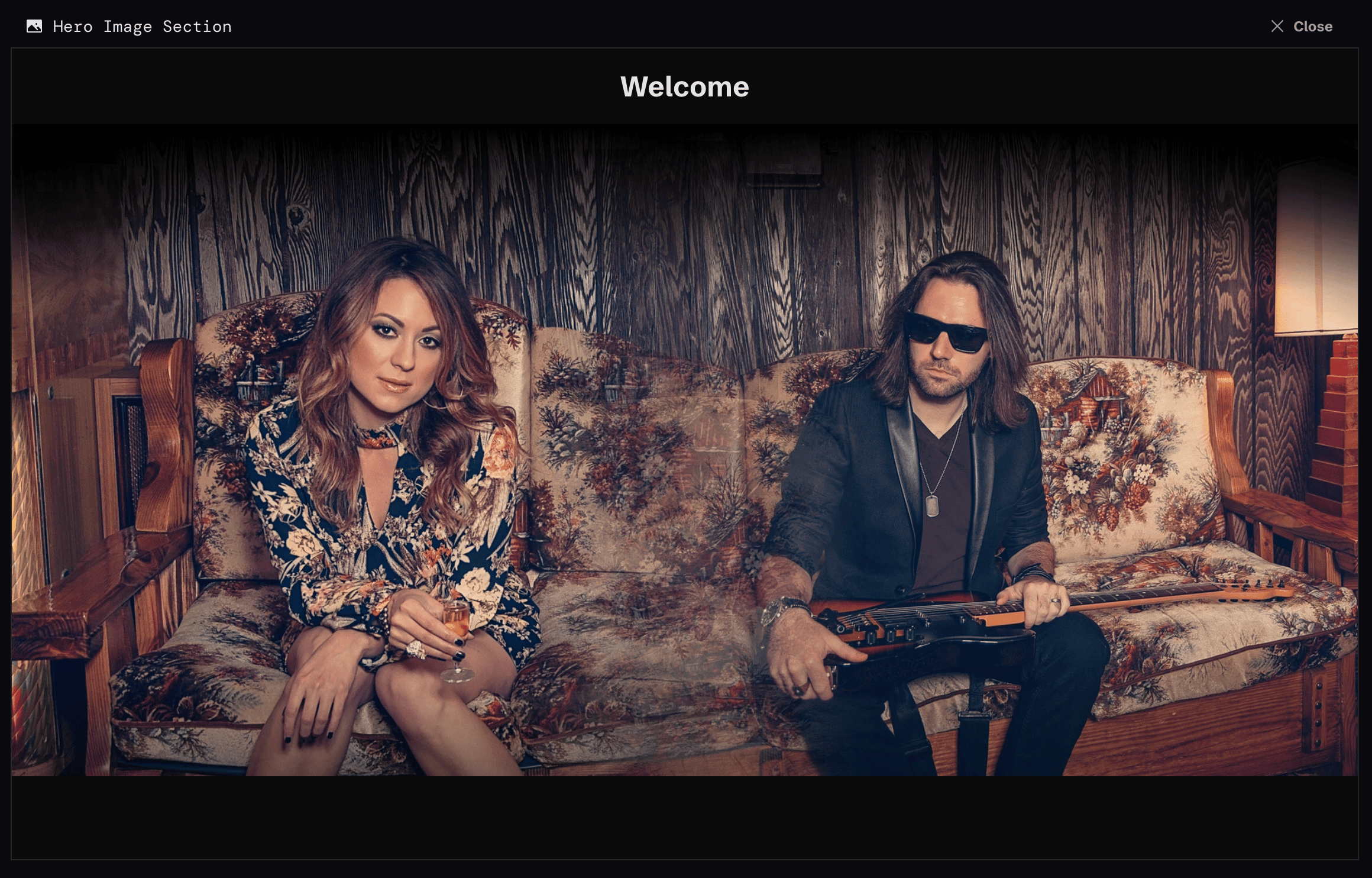
The images here are the ones you’ve added under “Photos” in the Content area. If the picker is empty, add a photo there first and it’ll show up.
A Different Image for Phones
A Hero Image section can hold two images, one for desktop and one for mobile. That’s useful when your best wide shot has too much empty space on a phone, or when a taller crop tells the story better. Each image in the picker has two buttons:Use on Desktop
The main hero image. This is what visitors on laptops and larger tablets see.
Use on Mobile
An optional alternate for phone-sized screens. Skip it and phones use your desktop image.
An image can only hold one of the two roles at a time. If you set your current desktop image to Mobile, it moves over rather than doing both, so pick a second image for the other slot.
Hero Image Section Options
The Full Width switch sits at the top of the same window. If set to full width, the image will “touch” the edges of the visitor’s screen. If not, the image will be centered in the section.Experiment with different images and width settings to create the best “first impression” when a visitor goes to your site if you’re using this section type as the very first section at the top of your site.